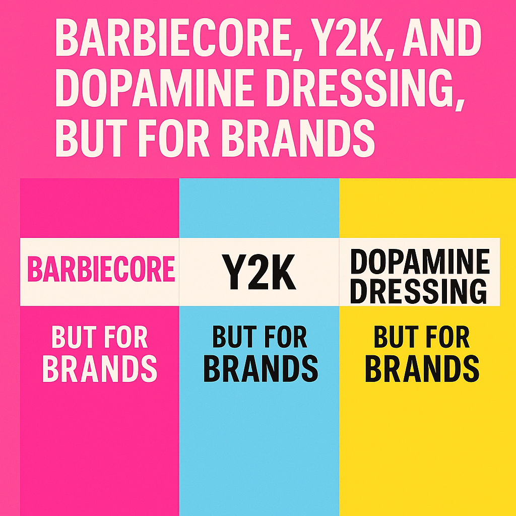
Some trends wear pink. Others wear nostalgia. And some? They practically dress in happiness itself. In the last few years, fashion’s big waves, Barbiecore, Y2K, and Dopamine Dressing, have taken over TikTok feeds, Pinterest boards, and street style snaps. But here’s the twist: these aren’t just making your wardrobe more playful. They’re rewriting the rules of branding.
Yes, you heard right. Brands are now taking their cues from bubblegum pink, retro tech aesthetics, and serotonin-powered palettes. Whether you’re launching a product, refreshing your visual identity, or creating a social media strategy, these trends can be your secret weapon to standing out in a sea of beige minimalism.
Let’s unzip this style-meets-strategy crossover.
Barbiecore: The Rise of the Pink Empire
In 2023, Greta Gerwig’s Barbie movie didn’t just break box office records. It made the world blush, literally. Pink stopped being “girly” and started being a global marketing move. Suddenly, brands from fashion to furniture were adopting Barbiecore: vibrant fuchsias, dreamy blushes, and playful pastels.
Why it works for brands:
Barbiecore isn’t just a color palette. It’s an emotion. It says, “We’re fun. We’re confident. We’re not afraid to be a little extra.” When Valentino launched their Pink PP collection, they weren’t just selling dresses; they were selling a feeling of hyper-glam, unapologetic joy.
For brands, pink can signal boldness and cultural relevance. It grabs attention on store shelves, makes Instagram grids pop, and, if done well, becomes instantly recognizable. Think of Glossier’s millennial pink or T-Mobile’s magenta.
How to bring it into your brand:
- Use pink as your hero shade in campaigns or packaging.
- Pair it with high-contrast typography for a modern twist.
- Infuse it into your storytelling; pink isn’t just for the visuals, it’s for the mood.
Y2K: The Comeback Kid
Remember flip phones, glittery MySpace profiles, and fonts that looked like they belonged on a Windows XP screensaver? Welcome back to the early 2000s, but shinier, sleeker, and intentionally nostalgic.
The Y2K revival is everywhere. Chrome gradients, butterfly motifs, pixel fonts, and pastel tech vibes have become staples for brands targeting Gen Z. The era’s digital innocence, when the internet was still a novelty, feels refreshing in a hyper-polished, algorithm-driven world.
Why it works for brands:
Y2K branding gives off a sense of playful rebellion. It’s about saying, “We don’t take ourselves too seriously.” It also taps into a massive nostalgia economy, millennials reliving their teen years and Gen Z discovering a retro aesthetic they never lived through.
Early adopters? Beverage brands, indie makeup lines, and streetwear labels. Take the beauty brand Lime Crime, whose packaging could double as a 2003 desktop wallpaper, or Bratz Dolls relaunching with holographic Y2K campaigns.
How to bring it into your brand:
- Experiment with chrome effects, holographic textures, and pixelated graphics.
- Create playful, almost ‘badly designed on purpose’ layouts for digital campaigns.
- Launch limited editions that feel like collectibles from a time capsule.
Dopamine Dressing: Branding for Happiness
While Barbiecore and Y2K lean into nostalgia and style, dopamine dressing is about pure mood-lifting energy. In fashion, it means wearing bold, happy colors because they make you feel good. For branding, it’s designing an identity that sparks joy the moment someone sees it.
Think of Oatly’s packaging with its chunky fonts and irreverent copy, or Ben & Jerry’s ice cream tubs that practically smile at you from the freezer. This isn’t minimal beige. This is “throw the whole paintbox on the table” energy.
Why it works for brands:
In a world where headlines feel like an emotional rollercoaster, joy becomes a differentiator. When your brand feels good to look at, it’s already halfway to winning loyalty. Dopamine branding says, “We’re here to make your day better,” and people buy into that promise.
How to bring it into your brand:
- Use unexpected color combinations, think turquoise with coral, lime with lavender.
- Play with typography that feels friendly and approachable.
- Infuse humor and positivity into copywriting.
When Trends Collide: The Triple Threat Brand Glow-Up
Here’s where it gets really fun: these trends don’t have to exist separately. Imagine blending Barbiecore pinks with Y2K chrome typography, then splashing in dopamine-level brights. You’d have a brand identity that feels nostalgic, joyful, and impossibly current.
One example? Starface, the skincare brand that sells star-shaped pimple patches. They’ve nailed dopamine dressing with playful yellows, sprinkled in Y2K digital charm, and aren’t afraid to go full Barbie-pink in campaigns. The result? They look like fun, not just skincare.
Another? Nintendo Switch campaigns. They mix playful colors (dopamine), retro call-backs to early consoles (Y2K), and bright character-driven worlds (Barbiecore-level personality).
Pitfalls to Avoid
Before you go full throttle into bubblegum chaos, a word of caution: trends are tools, not entire strategies.
- Avoid trend-hopping without meaning. If your brand is serious and luxury-driven, a hot-pink holographic rebrand might confuse your audience.
- Don’t sacrifice legibility. Bright colors and funky fonts are fun, but not if customers can’t read your product name.
- Plan for longevity. Trends fade. Build a core brand identity that works even when Barbie’s back in her DreamHouse.
How to Future-Proof Trendy Branding
You can absolutely ride the wave and keep your brand consistent:
- Start with your core values, ask how each trend can express them rather than replace them.
- Use trends in campaigns, not full identities. This lets you experiment without a risky overhaul.
- Create evergreen assets; your logo, typography, and main colors should stand on their own, even without trend elements.
Final Sip of Pink Glitter Latte
Barbiecore, Y2K, and dopamine dressing aren’t just fashion trends; they’re a mirror to what audiences crave right now. Joy. Nostalgia. Personality. And in a crowded, hyper-digital market, the brands that feel something and make us feel something are the ones that stick.
So whether you’re ready to drench your packaging in pink, pixelate your Instagram posts, or unleash a rainbow of happy hues, remember this: trends are the sprinkles, not the cake. But sometimes, a generous pile of sprinkles is exactly what makes everyone reach for a slice.
Suggested tags in para form: branding trends, Barbiecore marketing, Y2K design, dopamine branding, colorful branding, nostalgic marketing, Gen Z branding, playful design trends, brand personality, fashion-inspired branding, modern marketing strategies, cultural branding shifts, visual identity trends, creative campaign ideas, color psychology in branding