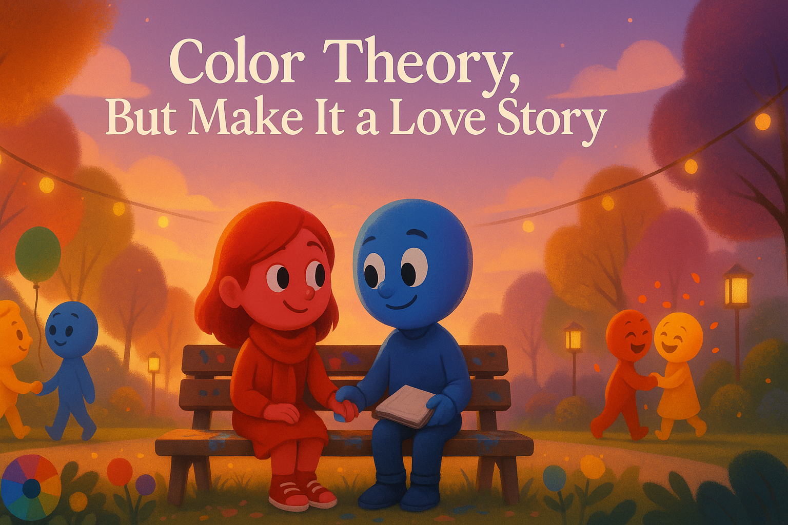
Once upon a time in the land of design, there lived a bold, passionate spirit named Red.
Hot-headed, attention-grabbing, and forever the main character in every room.
Then came Blue: calm, collected, the one who always brought the cool vibes to the party.
He didn’t need to shout to be heard. He just was.
They weren’t supposed to meet.
But when they did… it was magic.
And just like that, Purple was born.
When Red and Blue collided, they didn’t argue.
They blended. Not to overpower each other, but to create something entirely new.
Purple: mysterious, wise, balanced. The lovechild of passion and peace.
Purple didn’t just exist.
She arrived like royalty, carried drama in her stride, and somehow always knew things before anyone else did.
Welcome to the soap opera of color theory.
Meet the Cast
Red: The Drama Queen
Red loves the spotlight. She’s always in the front row, unapologetically bold, and allergic to the word “subtle.”
She’s the embodiment of passion, urgency, romance, and rebellion — wearing her emotions like a designer coat.
She flirts with Orange, fights with Green, and absolutely refuses to be ignored.
Blue: The Chill Philosopher
Blue is the quiet thinker. The one who calms a room just by being in it.
He owns the cool tones and carries the wisdom of trust, intelligence, and serenity.
He probably journals every morning and takes deep breaths before replying to emails.
Where Red is fire, Blue is ocean. Together? They’re a sunrise over a stormy sea.
The Love Affairs of Color
Color mixing is basically dating, equal parts chemistry and chaos.
Let’s break down the famous love stories of the spectrum.
Red + Yellow = Orange
This is the high-energy power couple. They’re loud, festive, bold, and love shouting “SALE” in all caps.
Orange is the life of the party, born from warmth and sunshine.
Yellow + Blue = Green
Nature’s favorite lovebirds. Together, they gave us all the meadows, leaves, forests, and the color of “Go.”
Green is calm and balanced, a therapist with hiking boots and a reusable water bottle.
Red + Blue = Purple
We’ve met her. Born of tension and balance, Purple is dramatic and mystical.
Too much Red, and she’s loud and chaotic like Magenta.
Too much Blue, and she’s deep and moody like Violet.
But get the mix just right, and she becomes regal, spiritual, and unforgettable.
Purple walks into a room, and people ask her for tarot readings.
Warm vs Cool: The Love Languages of Color
Every color has a love language.
Warm colors like Red, Orange, and Yellow are loud, flirty, full of energy, and make eye contact without blinking.
Cool colors like Blue, Green, and Purple are introspective, soft-spoken, and love midnight conversations about life and meaning.
Put the wrong colors together and they ghost each other.
Pair them right, and you get harmony, cinematic, emotional, scroll-stopping harmony.
The Science Behind the Flirting
Let’s nerd out for a second, because color theory isn’t just about pretty visuals — it’s visual psychology.
Complementary colors are opposites on the color wheel. They attract and spark high contrast. Think Red and Green, or Blue and Orange. Their chemistry is explosive.
Analogous colors are next-door neighbors. Blue, Blue-Green, and Green — they flow together with zero drama. Just smooth, harmonious vibes.
Triadic colors are the unexpected love triangle — Red, Yellow, and Blue. Each one brings a different flavor to the table, and together they’re colorful, unconventional, and beautifully balanced.
Your brand, your website, your motion graphics — they all speak before you do.
And they speak in color.
Colors seduce the audience long before your headline even loads.
Our Take at Studio Image Works
Here’s the thing — we don’t just pick colors. We cast them.
Like a director choosing actors, every shade we use has a role to play.
A personality. A mission. A moment.
We believe your brand is a love letter, and color is its ink.
Your motion graphics should feel like a color romance in motion.
Your story should never be beige — unless it’s on purpose (and even then, we’ll make beige iconic).
And They Lived Creatively Ever After
So next time you stare at a color palette, don’t just admire the hues.
Feel their chemistry.
Listen to the story they’re whispering.
Because in the world of design, every great project starts with one thing —
A little bit of love, and a whole lot of color.
What’s your color love story?
If your brand were a color couple, who would they be?
Tell us in the comments or drop us a message — we’ll help you find your perfect match.
And if you’re ready to make your brand fall in love with itself,
You know where to find us.